Orchestrating real-time logistics for a 450+ truck fleet
Overview
The problem
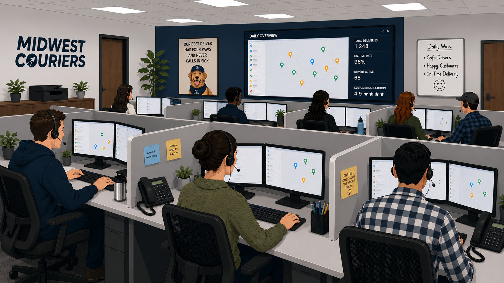
Midwest Couriers operates a fleet of 450+ vehicles. Unlike long-haul trucking, each dispatcher manages 50 active drivers at once. The floor is high-intensity and team-based. Decisions happen by the second. With drivers making 10 to 20 stops a day, the volume of real-time judgment calls had outgrown their legacy tools, and dispatchers were absorbing the stress the system couldn’t.
The solution
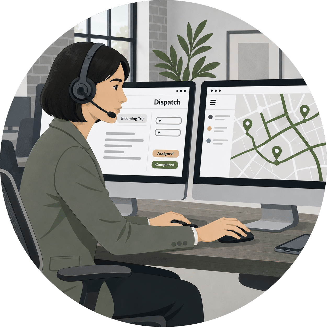
I led the design of a collaborative ‘cockpit’ interface built around how dispatchers actually work. They sit side-by-side at individual workstations, constantly coordinating with the colleague next to them. The system surfaces the entire fleet in real time, prioritizes the high-frequency interactions that define the role, and gives dispatchers the calm and precision same-day delivery demands.
My approach
Research-led product design for a real-time operations floor
I worked directly with the CEO, management team, and the dispatchers themselves. I wanted to learn the job before redesigning the tool.
Day in the life observations
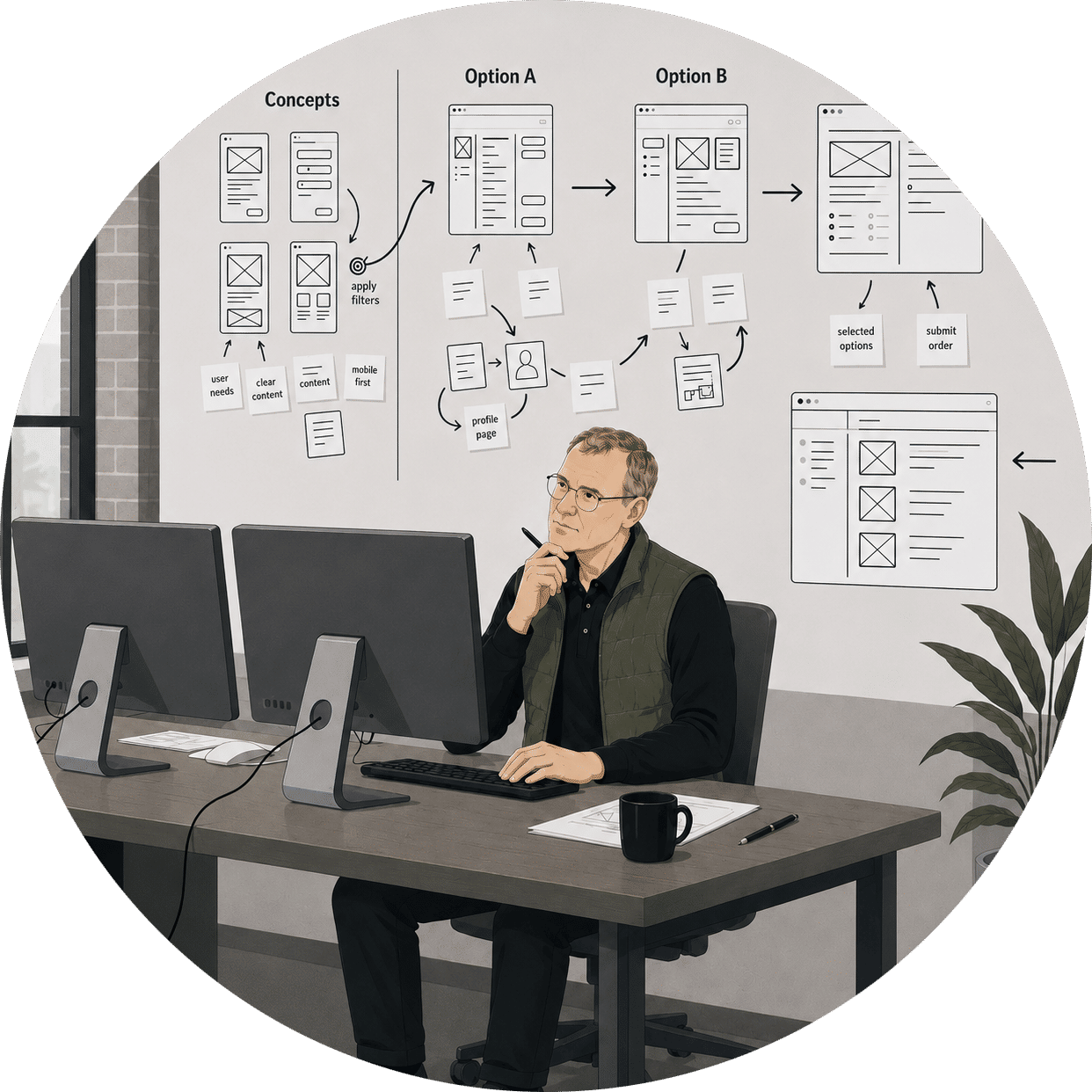
Sketch multiple concepts
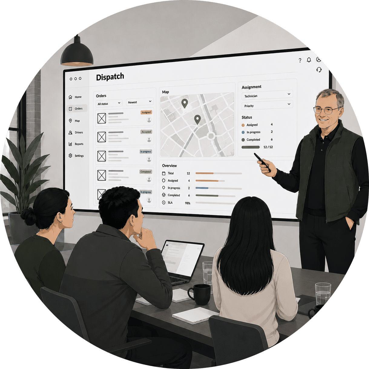
Test & refine with users
First instinct: a map-based view
My mind went straight to maps. I assumed I would do the job by visualizing geographic relationships. That is how I would have approached it. But once I sat with the dispatchers and watched them work, the assumption fell apart fast.
Map view integration
- Clustered map pins show order density and geographic distribution
- Color-coded markers differentiate between pickup points and delivery destinations
- Interactive map allows dispatchers to see spatial relationships between orders
Pivoting to scannable cards
Dispatchers didn't need maps. They knew every location code by heart. What slowed them down wasn't geography. It was scanning through endless lists. They needed dense, scannable cards they could sort, stack, and process at the speed of their expertise.
Card detail view
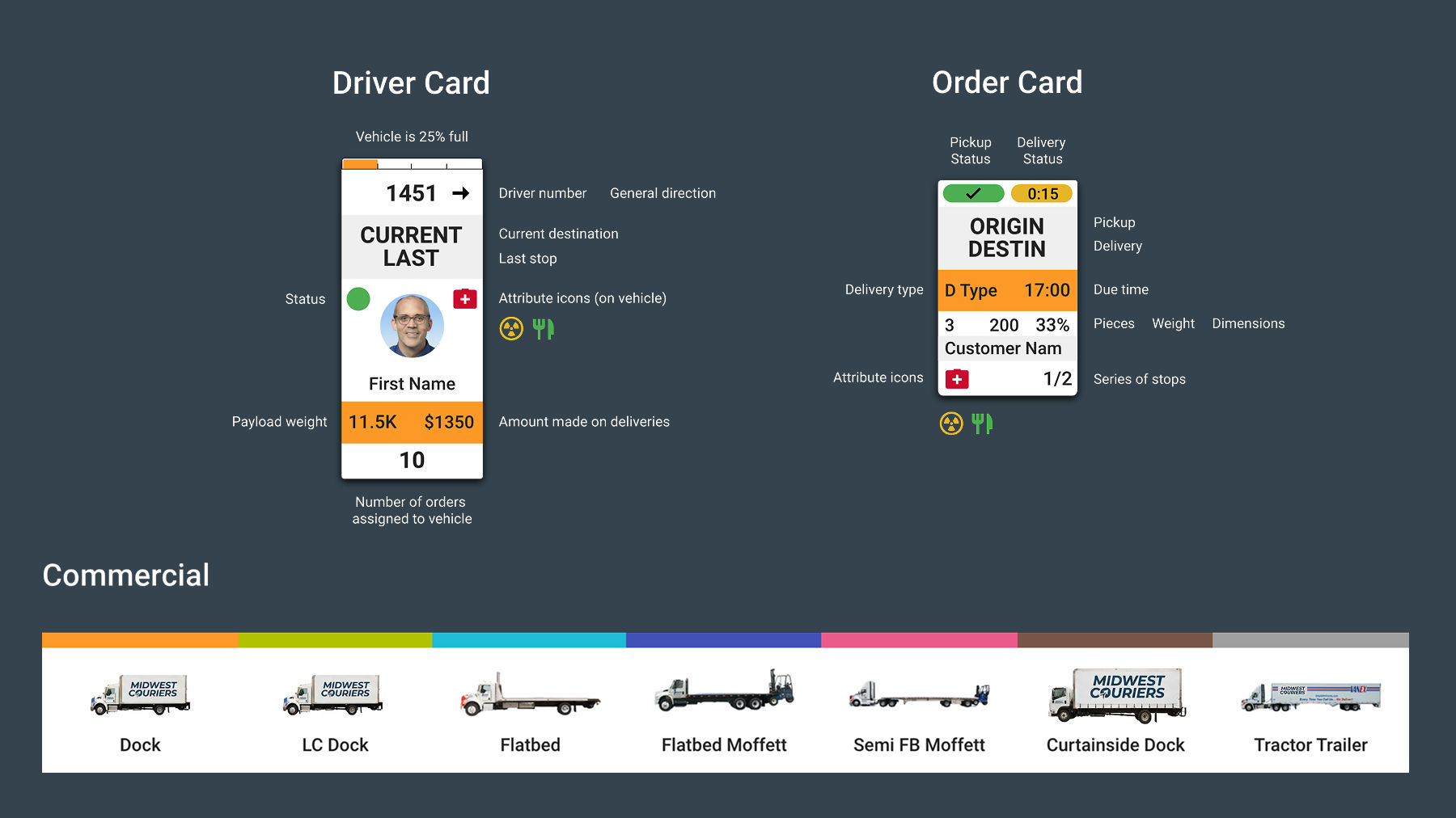
- Driver Card stacks live telemetry including location, status, and capacity metrics
- Order Card fits complex logistics data including addresses and time windows into a scannable tile
- Compact icons replace verbose text labels for pixel-perfect legibility
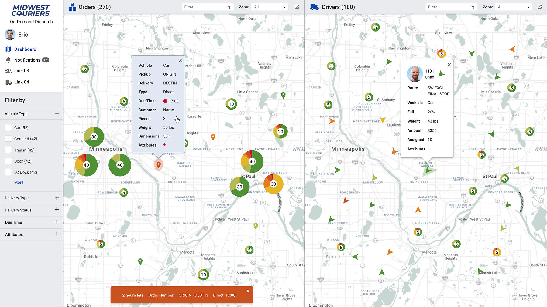
A cockpit for logistics
I designed a dual-monitor cockpit setup where every pixel earns its place. Dispatchers see the entire operation at a glance. No clicking through menus. No hunting for information.
Active drivers (left screen)
%203.png)
- Grid view displaying real-time status and availability for active drivers
- Individual cards featuring driver IDs, current load counts, and earnings metrics
- Filtering tools to organize the fleet by vehicle type, zone, or specific attributes
Parcel dispatcher view
This is where orders get assigned and chaos becomes routes. The interface makes complex batching decisions feel simple. It matches the pace at which dispatchers already think.
Active orders (right screen)
%202.png)
- Dispatchers consolidate orders into "Sweeps" to stage routes before assigning
- Lower panel displays a comprehensive queue of unassigned orders with filtering
- Intuitive interface allows users to drag orders from the queue into sweeps
Driver detail modal
When something goes wrong, dispatchers need details fast. A focused modal surfaces full driver context. It does this without pulling them away from the main dashboard.
Driver profile view
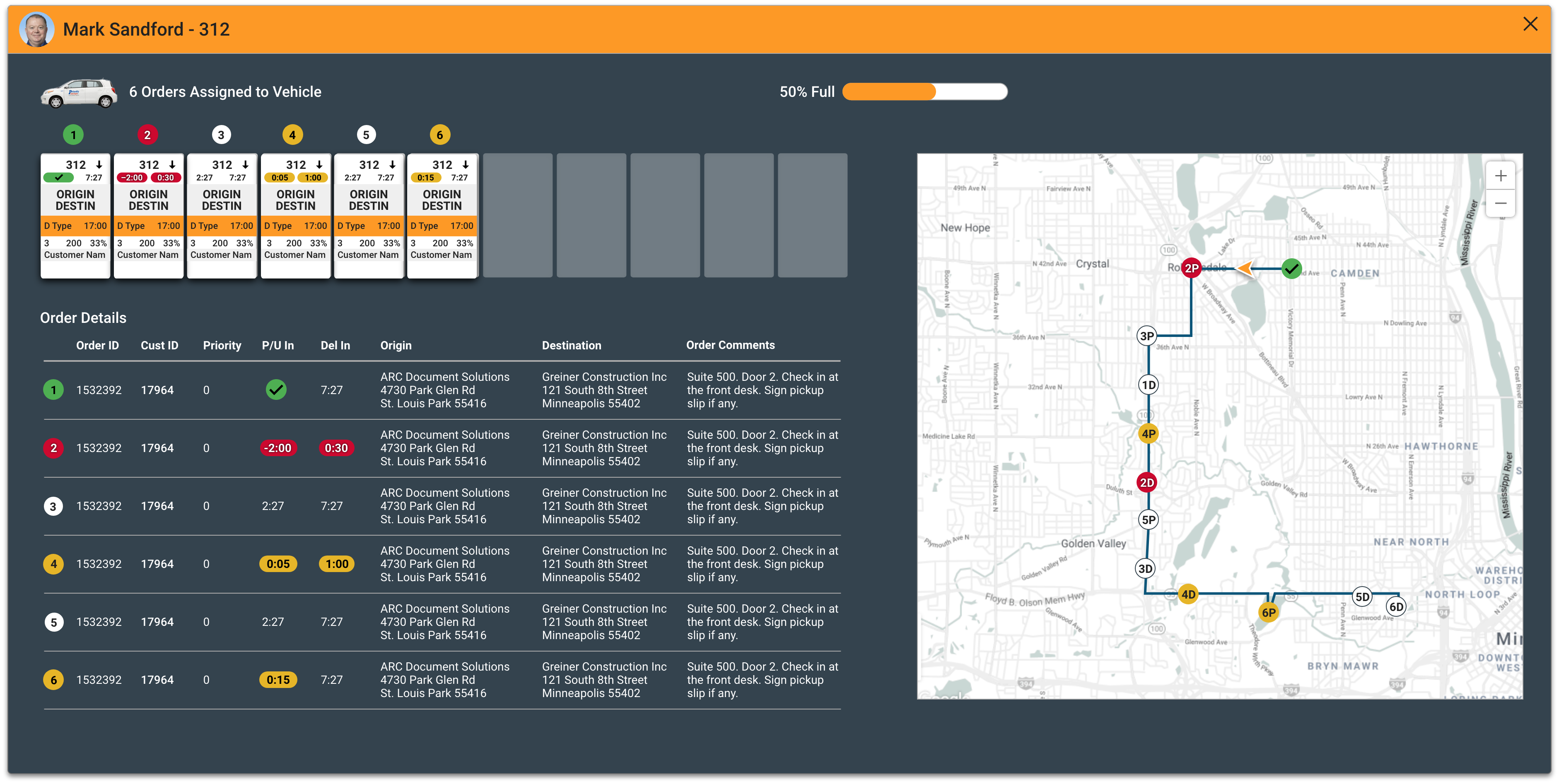
- Modal overlay visualizes vehicle capacity and assigned order cards
- Granular list details order specifics including priority status and time windows
- Integrated map view plots the complete route sequence with distinct markers
The impact
Information density became a competitive advantage when organized correctly. The dispatch floor stopped feeling chaotic and started feeling rhythmic, and the dispatchers who run it gained the confidence to handle peak load without burning out.