Scaling enterprise product design across 40+ SAP apps
Overview
The problem
Dozens of siloed enterprise applications created a fragmented ecosystem with inconsistent interfaces. For the people who lived inside it, every workflow asked them to relearn the same patterns. The design practice was reactive, cognitive load was high, and the business had no way to measure either one.
The solution
I led the work to unify 40+ apps under a single governed design system and accessibility standard. The interfaces started speaking the same visual language. Friction across the portfolio fell. UX shifted from a reactive support function to a measurable product practice teams could trust.
Who I worked with
Partners from strategy through delivery
- SAP application manager
- SAP general manager
- Product owners
- Portfolio analysts
- Practice managers
- Developers
- Business analysts
- Project managers
What I worked on
A portfolio of 40+ SAP Fiori business apps
My approach
Building an enterprise UX practice that scales
Four moves to take an enterprise UX practice from reactive to systematic, and to make 40+ apps feel like they belong to the same product.
Establish the foundation
Build a governed design system that standardizes 40+ apps.
Create feedback loops
Replace assumptions with in-app research and workflow insight.

Embed UX in governance
Make design quality a checkpoint in every release, not a last-minute review.
Drive cultural adoption
Train teams, surface wins, make UX a shared craft.
Establish the foundation
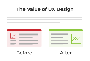
Before any of the bigger work, the apps needed to look and behave like they belonged to the same company. We audited the ecosystem and built a Fiori-based style guide with a reusable component library and shared accessibility standards. The shared vocabulary lowered cognitive load for users moving between apps, and it gave designers and developers a steady ground to stand on.
User experience audits

- Visual hierarchy
- Form clarity
- Feedback & alerts
- Accessibility & contrast
- Error recovery
- Readability
- Button alignment
Fiori style guide
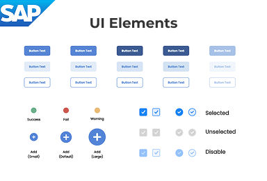
- Colors & typography
- Core UI elements
- Accessibility rules
Fiori pattern library
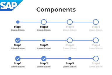
- Progress stepper
- Filter bar
- Dialog / Message box
Create feedback loops
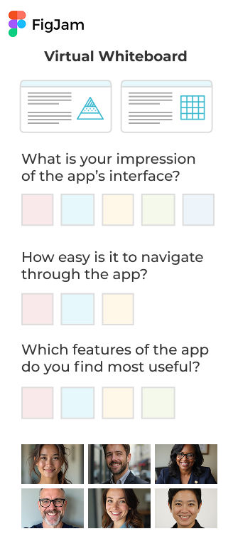
Most enterprise teams design without ever hearing from the people on the other end of the screen. We embedded in-app feedback, day-in-the-life research, and usability tracking so the teams building the apps could feel what their users were feeling. Assumptions gave way to evidence, and the conversation shifted from “what should we ship next” to “what’s actually getting in people’s way.”
In-app user feedback
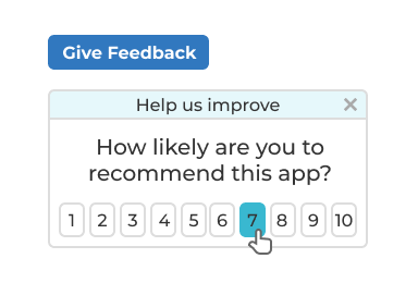
- Capture feedback at the moment of use
- Turn user insights into rapid improvements
Closing the loop
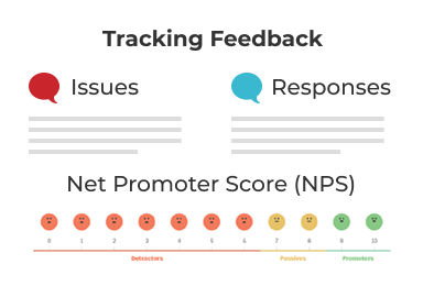
- Establish communication loop between product teams & users
- Track feedback over time
“Day in the life” interviews
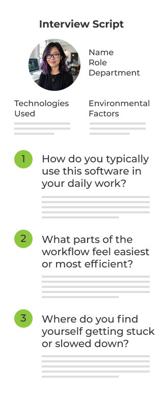
- Workflow optimization
- Pain points
- Workarounds
- Efficiency blockers
- Information flow
- Collaboration gaps
- User expectations
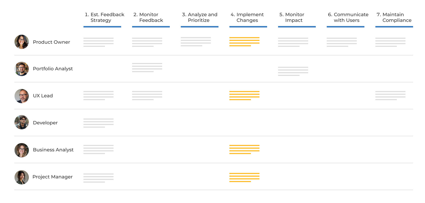
Embed UX in governance
Design quality lives or dies in the moments between intake and release. We integrated UX and accessibility checkpoints across the product lifecycle so quality wasn’t something added at the end. The standards stopped being aspirational and started showing up in every release.
Cross-functional workflow for app feedback
Drive cultural adoption
Tools and standards don’t transform a culture on their own. We invested in training, surfaced the wins out loud, and made it normal to talk about user experience the same way teams already talked about uptime or revenue. UX moved from “someone else’s job” to a shared craft.
Design thinking workshops
- Usability
- Accessibility
- Visual design
- Information architecture
- Performance
- Adoption
- Business Alignment
Success stories
- Build awareness
- Inspire teams
- Strengthen credibility
Product health scorecard
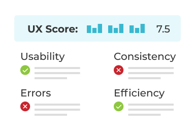
- Empower teams to run their own UX evaluations
- Identify areas to improve
The impact
True design isn't just about pixels. It's about the system that produces them. And it kept working after I left.