Making 40+ enterprise apps feel like one product
Overview
The problem
The company ran more than 40 SAP apps, built by different teams at different times. Someone in the field might open four before lunch and relearn each layout. Design came in at the end to clean up, if at all. No one could say whether any of it worked, because no one measured it.
The solution
I built one design system and one accessibility standard for all 40+ apps. Then I made them easy to use, with a shared component library and design checkpoints written into the release process. The apps started to look and work alike. People stopped relearning the same screens. And design quality finally had numbers behind it, so the business could see what it was getting.
Who I worked with
Partners from strategy through delivery
What I worked on
A portfolio of 40+ SAP Fiori business apps
My approach
Building an enterprise UX practice that scales
Four moves that turned scattered, one-off design work into a system, and made 40+ apps feel like one product.
Establish the foundation
Build one design system that all 40+ apps share.
Create feedback loops
Trade guesswork for feedback from the people using the apps.

Make quality routine
Check design and accessibility at every step, not just at the end.
Get teams to own it
Train teams, show what’s working, make UX everyone’s job.
Establish the foundation
Before any of the bigger work, the apps needed to look and behave like they came from the same company. We reviewed all of them. Then we built a Fiori style guide with a reusable component library and accessibility rules everyone worked from.
Once a button looked like a button everywhere, people could stop thinking about the interface and get on with the job. Designers and developers stopped guessing, too.
User experience audits
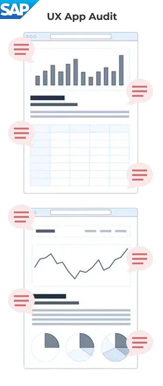
- Visual hierarchy
- Form clarity
- Feedback & alerts
- Accessibility & contrast
- Error recovery
- Readability
- Button alignment
Fiori style guide
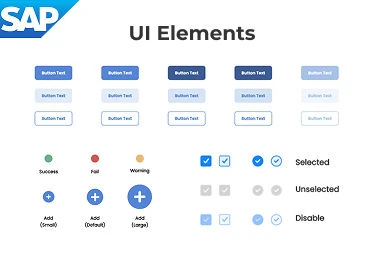
- Colors & typography
- Core UI elements
- Accessibility rules
Fiori pattern library
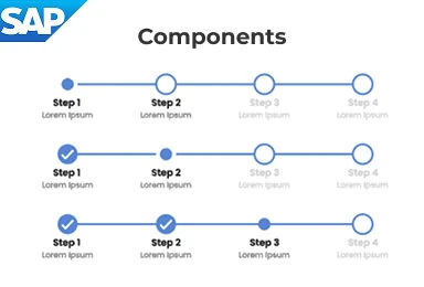
- Progress stepper
- Filter bar
- Dialog / Message box
Create feedback loops
Most enterprise teams design without ever hearing from the people on the other end of the screen. We added feedback right inside the apps. We sat with people during their workday and tracked where they got stuck. That way the teams building the apps could feel what their users were feeling.
Assumptions gave way to evidence. The conversation shifted from “what should we ship next” to “what’s actually getting in people’s way.”
In-app user feedback
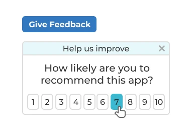
- Capture feedback at the moment of use
- Turn what people tell us into quick fixes
Closing the loop
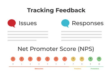
- Keep product teams and users talking
- Track feedback over time
“Day in the life” interviews
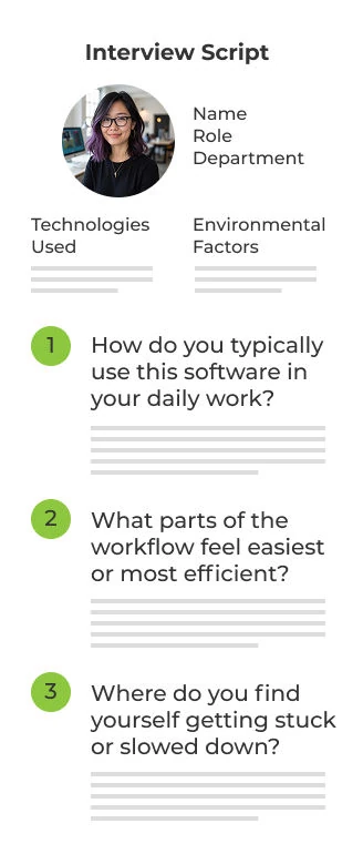
- Workflow optimization
- Pain points
- Workarounds
- What slows people down
- How information moves
- Collaboration gaps
- User expectations
Make quality routine
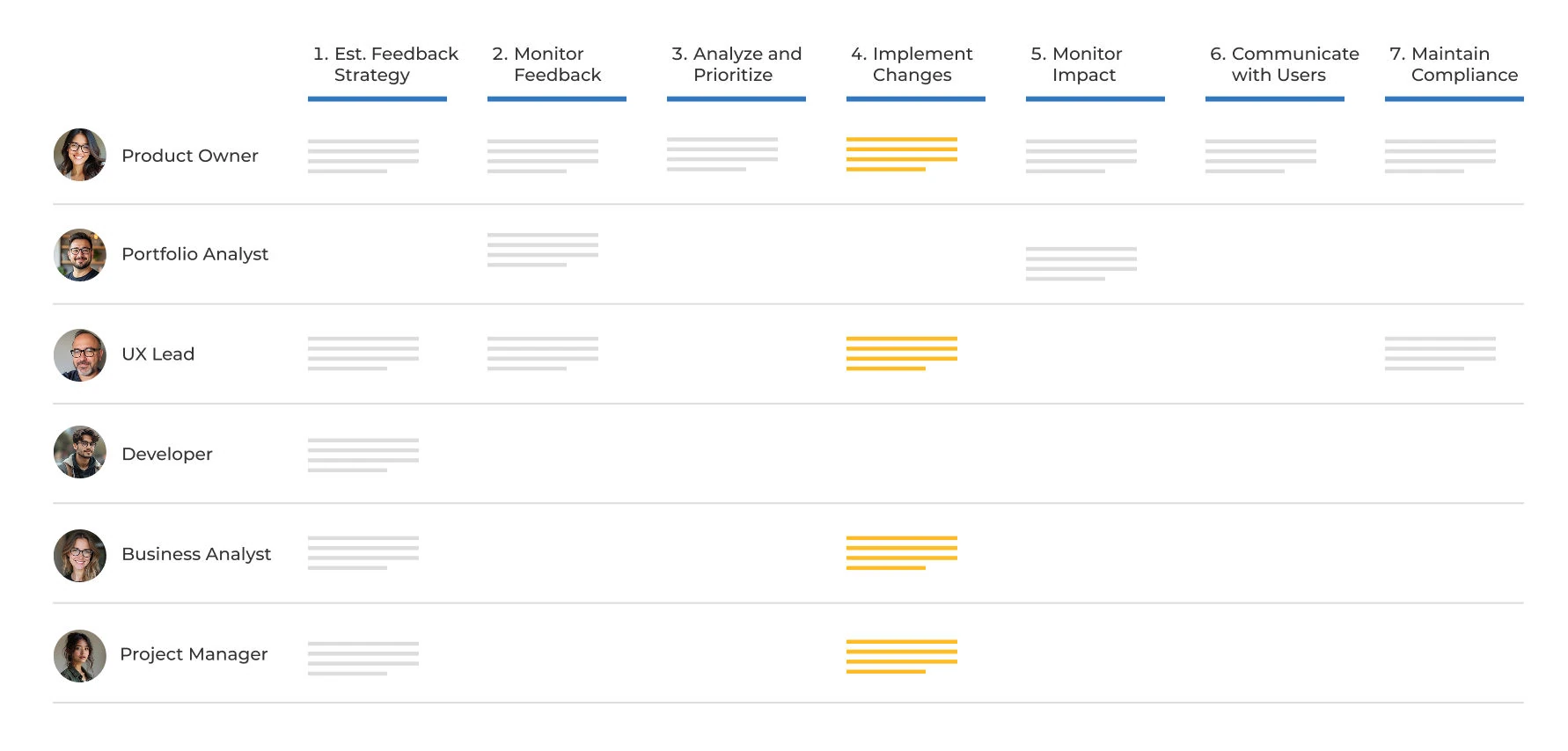
Design quality is decided between the moment a request comes in and the day the app ships. We added UX and accessibility checks at every step in between, so quality wasn’t something bolted on at the end. The standards stopped being a document and started showing up in every release.
Cross-functional workflow for app feedback
Get teams to own it
Tools and standards don’t change a culture on their own. We ran training and told the stories of what was working. We made it normal to talk about user experience the same way teams already talked about uptime or revenue. UX went from “someone else’s job” to a shared craft.
Design thinking workshops
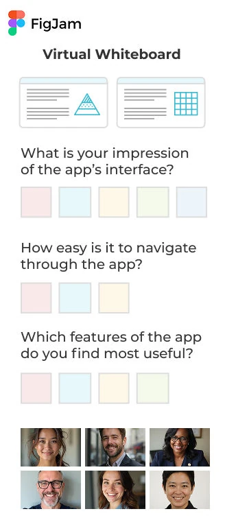
- Usability
- Accessibility
- Visual design
- Information architecture
- Performance
- Adoption
- Business alignment
Success stories
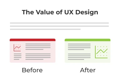
- Build awareness
- Inspire teams
- Strengthen credibility
Product health scorecard
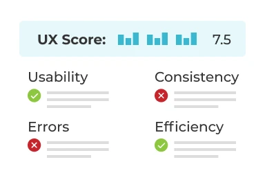
- Let teams run their own UX checks
- Identify areas to improve
The impact
How I measured this
How each figure above was counted, over what period, and what it cannot tell you.
- Design to development, about a third less time
- From the team’s work tracker: the time from a design being marked ready to development starting on it, averaged per story. It compares the two quarters before the shared library with the two quarters after it was in use. Story size was not normalized, so this is a trend across many stories, not a saving on any single one.
- UI defects in production, roughly half
- Production defects that QA tagged as UI (layout, labels, inconsistent components), counted per quarter. The drop followed the accessibility and design checkpoints going into the release process. Releases also got smaller over the same stretch, which helped.
- New-user training time, cut in half
- The training team’s figure: hours of instructor-led onboarding for a new field user, before and after the redesigned flows. The annual savings are their estimate. I did not audit it, so no dollar figure appears here.
- NPS, up roughly 20 points
- The in-app survey the product team already ran each release, compared across several release cycles. Responses per release were modest, so the change is read across releases rather than from any one of them.
- Hundreds of one-offs, one small library
- An inventory of the interface components across the 40+ apps at the start, set against the shared library at the end.

True design isn't just about pixels. It's about the system that produces them. And it kept working after I left.